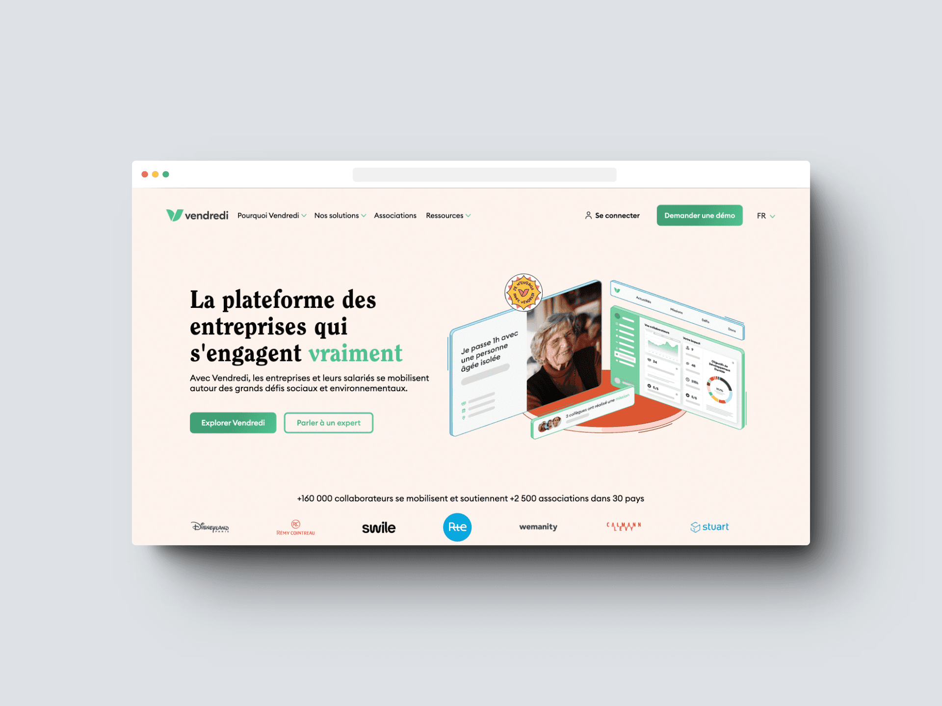
about vendredi
Vendredi offers a SaaS platform for companies to engage employees in corporate social responsibility.
The platform has two modules: "Awareness" for understanding key issues through challenges, and "Support for Associations" for missions and donations.
Employees have personalized accounts reflecting their company's branding.
the brief
At Vendredi, we have a conviction: commitment is everyone's business.
To mobilize each employee, we need to provide an exceptional user experience!
The launch of a company into Vendredi is crucial for the movement to gain momentum. If from the beginning the users do not understand the interest of the platform, we lose them.
Today, only 14.7% of eligible employees are registering on the platform.
things to consider
user research
We conducted user researches to identify pain points in the existing platform, with four specific objectives in mind.
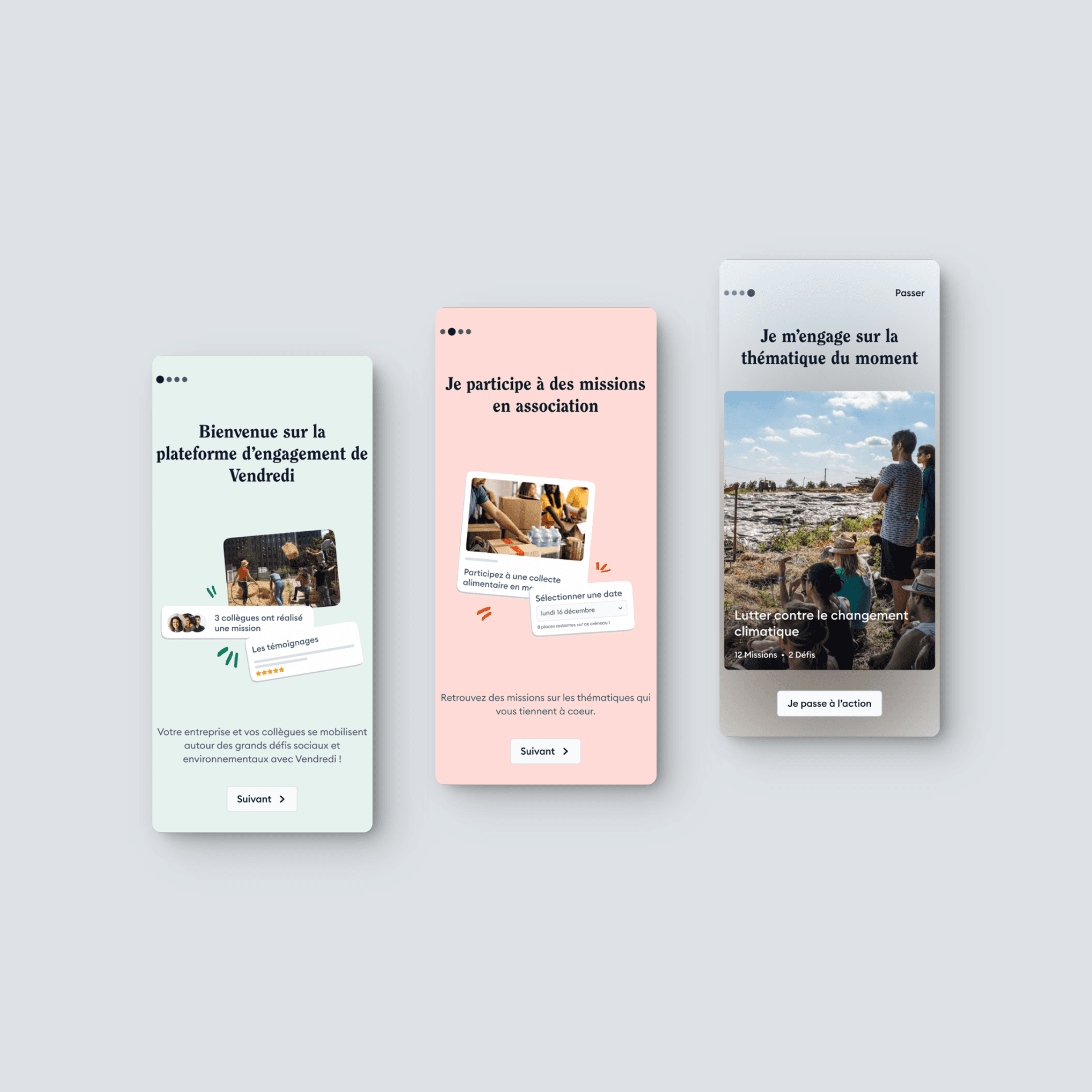
Evaluate comprehension of the onboarding slides
Evaluate ability to customize their research
Evaluate employees' ability to select missions
Evaluate understanding of the platform's concept
user call
what we have learned from the user reasearch
The current onboarding slides are not effective in engaging users.
“Personally, I usually skip the onboarding slides. Since I have seen the website on the background already, I wanted to see the rest.” - Gaël
Users do not feel sufficiently invested in the proposed actions on the platform.
“If you wanted to know more about me, you would have asked me before taking a mission” - Eden
From our analysis, we've learned how vital it is to grab employees' attention early on to deepen their involvement with Vendredi's platform.
To achieve this, we're focusing on implementing changes that offer users an immersive initial experience with the platform, ensuring their engagement is sustained throughout their journey.
define the problem
How can we enhance engagement by rethinking the process of employee onboarding?
objectives
Introduce employees to the CSR strategy during onboarding.
Design an onboarding journey for employees to take their first action.
ideation
We experienced diverse stages and methods to organize our ideas.
Benchmarking aided in integrating key elements into our solution.
We did further research to be aware of the best onboarding practices.
gains from research
To immediately engage employees, we've revamped the onboarding process.
This includes a new step where users select their interests, coupled with an introductory challenge to raise awareness. This approach not only sparks initial involvement but also motivates continuous participation by involving users in their company's ranking from the start.
selected ideas
First, we optimized the onboarding flow to develop three new functionalities.
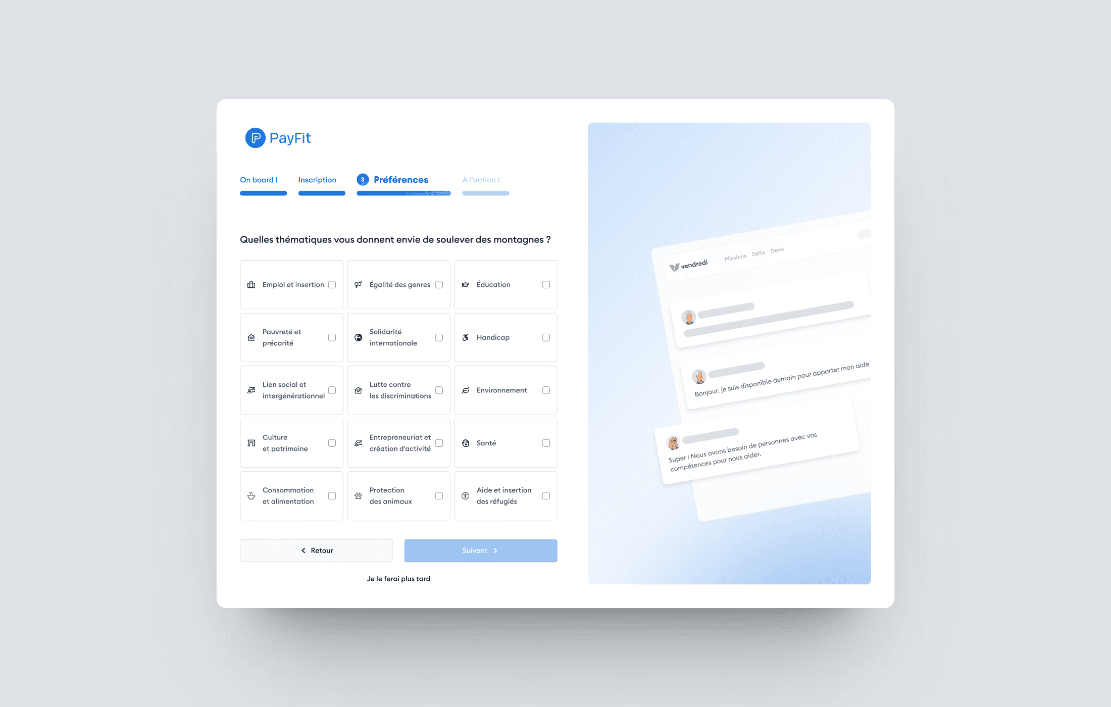
We've integrated interest customization into the process to engage users.
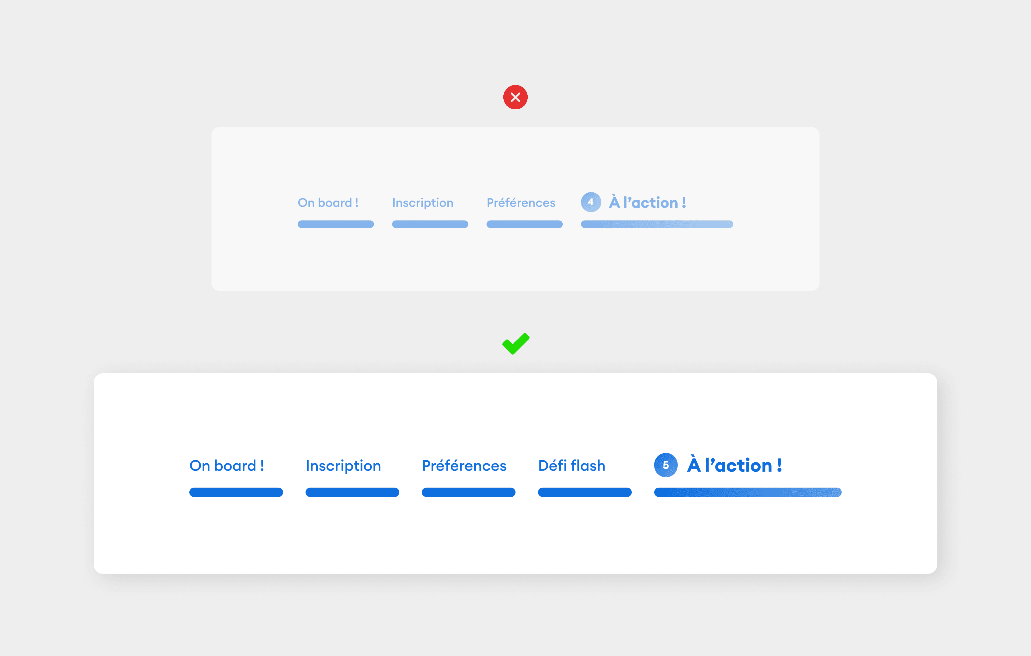
Added a progress bar to inform users of onboarding completion status.
Added an awareness challenge into the onboarding to generate interest
prototype & test
user test
Upon finishing the prototype stage, we carried out user testing to assess the efficacy of our approach, focusing on two primary goals.
We performed 30-minute user evaluations with a varied group of 5 participants from different backgrounds and age ranges, one of which was a Vendredi's user.
objectives
Enhanced user understanding and engagement during onboarding.
Understanding of the new personalized space.
Positive outcome
The progress bar
By incorporating a progress bar during the onboarding process, users were motivated to continue as they had a clear idea of the remaining time and upcoming steps.
“I know where I am, it's quick, and it encourages me to continue.” - Anojh
Positive outcome
interests selection
Integrating customization into the onboarding process was more engaging for users as it allowed them to anticipate content tailored to their preferences
“The customization and thematic options prior to finding missions are excellent.” - Ismayla
Pain point
progress bar confusion
We revised the misleading wording in the challenges step and added a step to distinguish between actions and challenges, clarifying the user's journey.
“It feels like a sudden transition from one thing to another, maybe it would be helpful to announce it. I was expecting actions, not a challenge.” - Halimata
Pain point
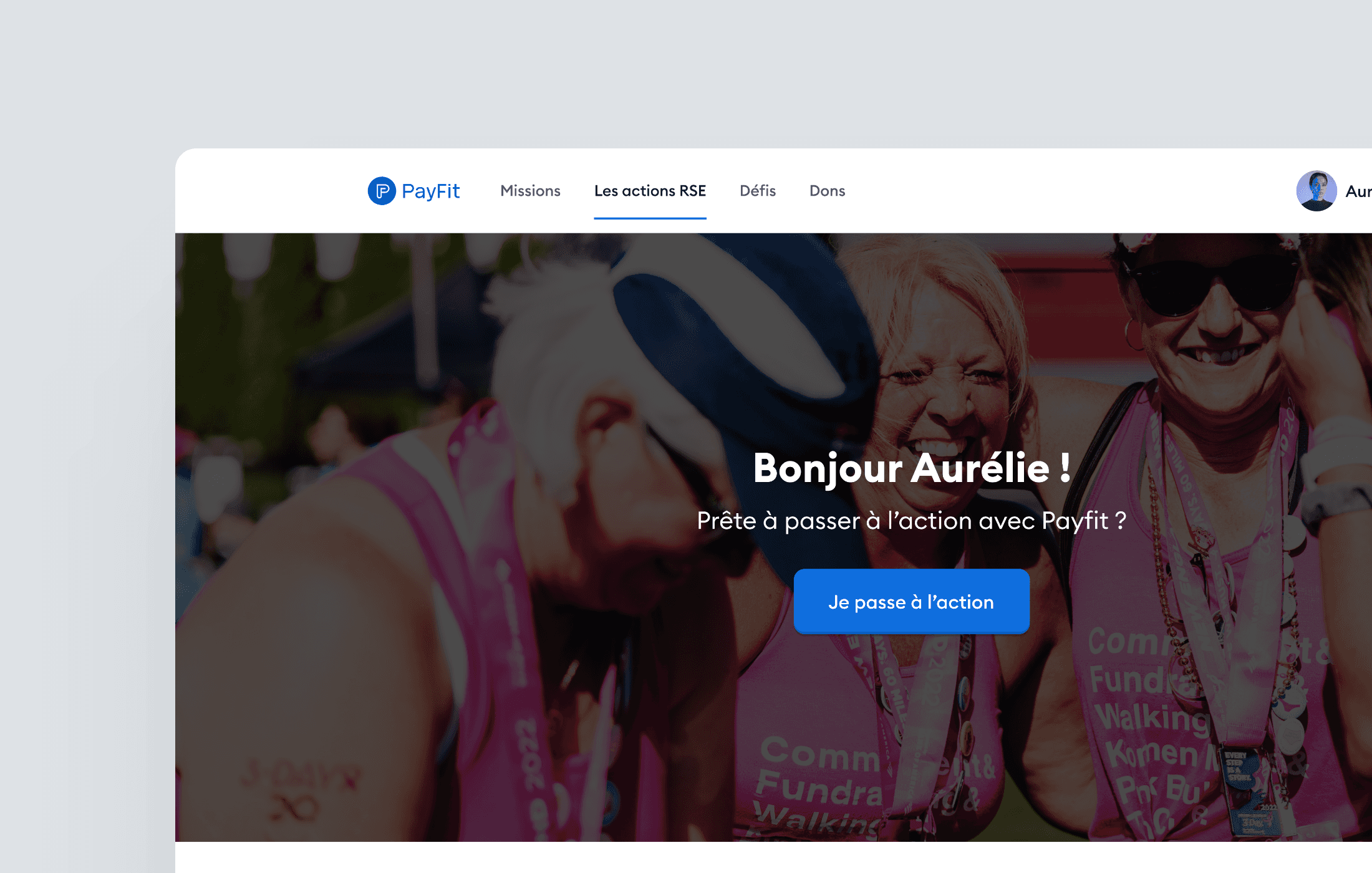
the wording
The chosen wording caused confusion among users who did not understand the purpose of the CSR actions page, which was supposed to present the missions highlighted by companies.
“I didn't understand the difference between the "missions" and "CSR Actions” tabs. - Emri
To address this, we reverted back to the original wording "Company News" to provide clarity on the content.
This page specifically focuses on actions related to the employee's company.
conclusion / what's next
